Introduction to Unity UI – Part 2
In this second part of a three-part tutorial, you’ll learn how to incorporate animations into your user interfaces.

Update 20th December 2016: This tutorial was updated to Unity 5.5 by Brian Moakley. Original post by Kirill Muzykov.
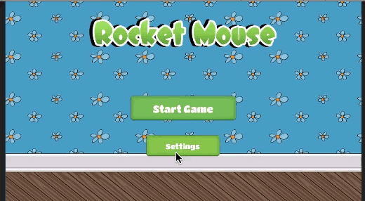
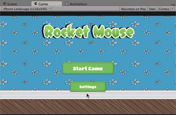
Welcome back! In part 1 of this three-part tutorial series, you created a nice scene with two buttons. You learned how to use the Image, Button and Text UI controls, as well as concepts such as anchors and anchors. However, the scene itself is pretty simple and in need of an upgrade.In this tutorial, you’ll spruce up the scene by adding animations, a settings dialog and more UI controls like the slider and the toggle. If you don’t have the project already, download it here.
So, go ahead and open the project in Unity. Open the MenuScene, grab an invigorating beverage and start thinking UI!
Animating Buttons
You’re going to jump right into the exercises by adding some cool animations. There are several reasons for that. First — animations are cool! Second, they’re practical for this project. You need the buttons to exit from the scene so that there will be enough space to display the new dialog that you’ll create later.
Creating Animation and Animator
Animating buttons is no different from animating any other Unity object. You’ll need to add an Animator component, create a few animations and set up states and transitions between them.
Here are the steps to success:
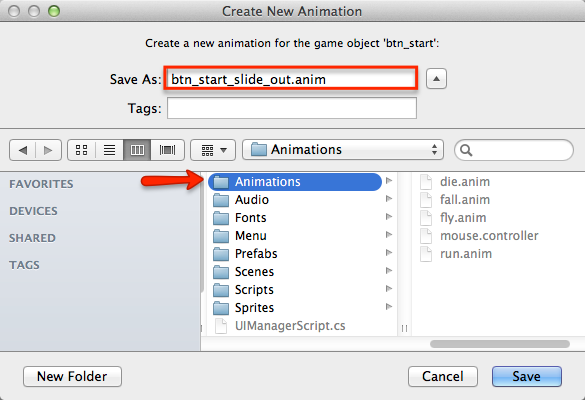
- Select Btn_Start in the Hierarchy
- Open the Animation view.
- Click on the Create button in the Animation view. This will create the Animator and an animation clip.
- Name the animation btn_start_slide_out and save it in the Animations folder.
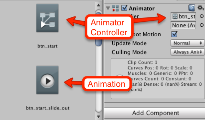
In addition to creating the animation itself, Unity also kindly adds an Animator component to btn_start and creates an Animator Controller.
Animating a Button Sliding Out of the Screen
Although you’ll technically make two animations — the button slide out and then the slide back in — you’re going to be a savvy developer and create one, and then reverse it.
To create the slide-out animation, follow these steps:

- Select Btn_Start in the Hierarchy
- Make sure the Animation view is visible.
- Click on the 1:00 mark in the timeline and make sure animation recording turns on. It should do this automatically.
- Change anchors to top-stretch.
- Change Pos Y to 60 in the Inspector.
- Stop the recording by clicking the red circle button.
Note: The easiest way to make sure recording is on is to take a look at the playback controls and watch for them to turn red.
A: A keyframe was inserted automatically at the 0:00 mark. At this point, the button is at its starting position, precisely where you positioned it in the previous tutorial.
B: Although the anchors’ visual representation didn’t turn red, you can see the numeric values changed and turned red, indicating that you’ve also animated the anchors.
Make both the Animation view and Scene view visible and play the animation. You’ll see something like this:
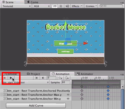
Did you notice the animation on the anchors? If not, surely you noticed that annoying blinking red arrow.
Anyways, why do you need to reposition anchors?
Well, when you think about it this way, it’ll be obvious: the position of the button is the distance to its anchors. In the case of btn_start, it was the distance from the bottom edge. Right now, you’re only working with vertical movement, so only the bottom edge matters.
To make sure the button “leaves” the screen, you move it up until it’s no longer visible. What do you do if you don’t know the height of the screen? How do you make sure the button stops right after it’s no longer visible?
The answer is by changing its anchors.
If you set the anchors to the top edge of the screen, you simply set set the distance from the top edge of the screen. Thus, the button will always be above the edge and independent from the height of the screen, since it’s positioned relative to the screen’s top edge.
Animating Button Slide In
Nice work! You have a button that slides out of the screen, and now you need a reverse animation. You’ll use it in two cases:
- When the scene loads, you want the button to slide into position instead of simply appearing.
- When you close the settings dialog, the buttons should return to their initial positions
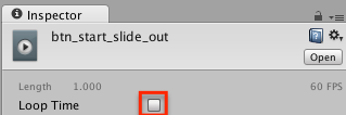
It’s quite easy to do. First, you need to disable looping of the animation, since the button should move either up or down and then stop instead of moving back and forth like a ping-pong ball.
To disable looping, open the Animations folder in the Project window and select the btn_start_slide_out animation. In the Inspector, uncheck Loop Time.
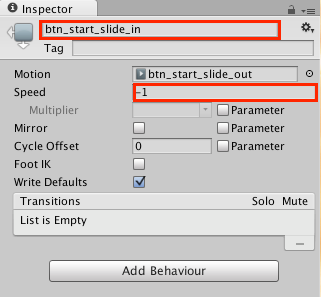
Then select Btn_Start in the Hierarchy and open the Animator view. Right-click on the btn_start_slide_out state and select Copy.

Then right-click somewhere on the free space inside the Animator view and select Paste. This duplicates the btn_start_slide_out state.

Now, select this duplicated state, likely called something like btn_start_slide_out 0, and rename it to btn_start_slide_in in the Inspector. Additionally, set Speed to -1.
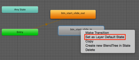
Then, inside the Animator view, right-click on the btn_start_slide_in and select Set As Layer Default State, since you want the button to start its lifecycle by sliding into the screen and not vice-versa.
Next, you need a parameter to control the state of the button. In the left hand column of the Animator window, click the Parameters tab. Next, Click the + button and add new Bool parameter named isHidden.

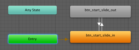
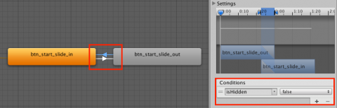
Finally, add two transitions between the states. To do this, right-click on the btn_start_slide_out state and select Make Transition. Then click on the btn_start_slide_in to make a transition.
After that, create a reverse transition by right-clicking btn_start_slide_in, selecting Make Transition and then clicking on the btn_start_slide_out. This is what you should get in the end:
You’re close, but you still need to assign a value to isHidden based on which transition is occurring.
Select the transition from btn_start_slide_out to btn_start_slide_in. In the Inspector, click the + in the Conditions panel. Set isHidden to false.
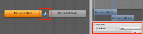
Then select the transition that goes in opposite direction, from btn_start_slide_in to btn_start_slide_out and set its Conditions to be isHidden equals true.
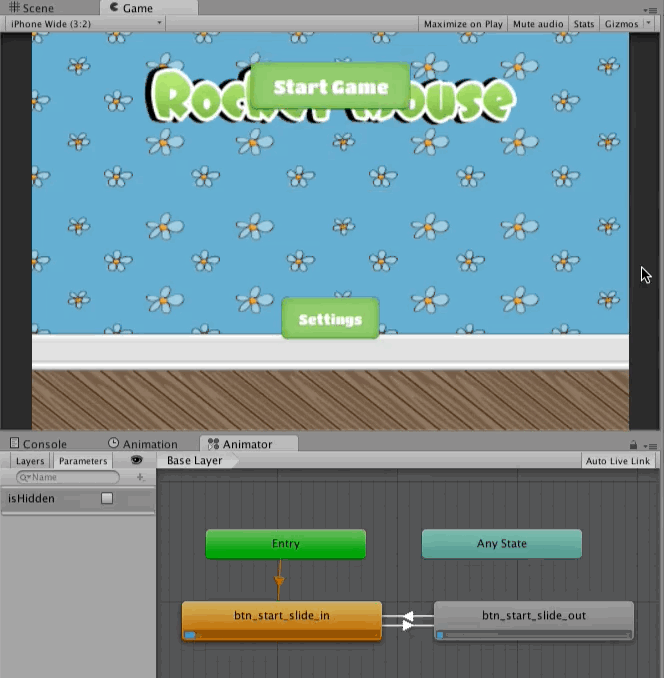
Select File / Save Scenes to save your work so far and then run the scene. You should see your button sleekly sliding in. Then change isHidden manually to make the button slide back.
Animating the Settings Button
The Settings button should slide down the screen to make some space in the center for the dialog.
Do you think you can animate the settings button yourself? All you need to know is:
- Offscreen Pos Y should be -50
- You don’t need to change anchors, since the button is already positioned relative to the bottom edge of the screen.
Give it a try on your own. If you need a nudge, feel free to sneak a peek into the spoiler below.
[spoiler title=”Animating Settings Button”]
To create the slide down and slide up animation, as well as setup Animator states, follow these steps:
- Select Btn_Settings in the Hierarchy.
- Open the Animation view.
- Click on the Create button.
- Name the animation btn_settings_slide_out and save it in the Animations folder. This will also create the Animation Controller and will add the Animator component to the btn_settings.
- In the Animation view, click on the 1:00 mark of the timeline and make sure recording is on. It should turn on automatically, but you can click on the red circle to start manually recording.
- In the Inspector, change
btn_settingsPos Y to -50. You don’t need to change anchors this time. - Stop recording by clicking the red circle button or by saving the scene.
- Open the Animations folder in the Project window. Select btn_settings_slide_out, and uncheck Loop Time in the Inspector.
- Select Btn_Settings in the Hierarchy.
- Now open the Animator view.
- Copy and paste the btn_settings_slide_out state to duplicate it.
-
Select the duplicated state, which should be named
btn_settings_slide_out 0. In the Inspector change its name to btn_settings_slide_in, and change its Speed to -1. - Right-click on the btn_settings_slide_in state and select Set As Layer Default State.
- Create a transition from btn_settings_slide_in to btn_settings_slide_out, then create a reverse transition.
- Add a new Bool parameter named
isHidden. - Select the transition from btn_settings_slide_out to btn_settings_slide_in and in the Inspector, change Conditions to contain
isHiddenequals false. - Select the transition from btn_settings_slide_in to btn_settings_slide_out and change Conditions to contain isHidden equals true.
- Select File / Save Scenes to save your work so far and then Run the scene.
[/spoiler]
This is what you should get in the end:

Well, it’s nice to see the Settings button going up and down, but shouldn’t both buttons slide out simultaneously, just as they slide in at the start?
Of course they should, and you’re going to make that happen next.
Triggering Buttons Animation from the Script
In MonoDevelop, open the UIManagerScript that you created in Part One, and add the following instance variables just inside the class definition:
public Animator startButton;
public Animator settingsButton;
After that, add following method:
public void OpenSettings()
{
    startButton.SetBool("isHidden", true);
    settingsButton.SetBool("isHidden", true);
}
That is the all code you need. Save the script and switch back to Unity.
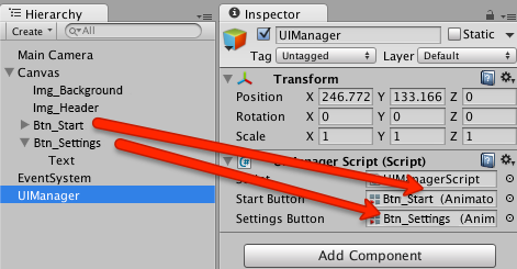
In Unity, select UIManager in the Hierarchy. Drag Btn_Start from the Hierarchy to the Start Button field in the Inspector and drag Btn_Settings to the Settings Button field.
Then select Btn_Settings in the Hierarchy and click + in the On Click() list. Drag UIManager from the Hierarchy to the new item in the list. After that, open the function selection menu and select UIManagerScript \ OpenSettings ().

Select File / Save Scenes to save your work so far and then Run the scene. Wait for the buttons to stop moving and click on the Settings button. You should see both buttons move out of the screen in opposite directions simultaneously.
Adding the Settings Dialog
Look at all that gorgeous free space you created! That seems like the perfect place for a dialog to slide in there and fill the empty space. After all, nature abhors a vacuum :]
Creating the Panel
Usually, dialogs contain some other controls that should appear and move with dialog. Hence, it’s effective to create the dialog as a panel and set other UI Elements as child objects.
To create a panel, select GameObject \ UI \ Panel in the menu. This will create a full-screen panel that uses a white, semi-transparent image as a background. So, you should see some kind of full-screen veil.
However, this dialog won’t be full-screen; in fact, it will be relatively small. Follow these steps to set the dialog’s size and position:
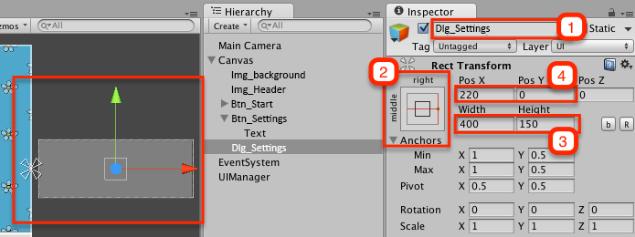
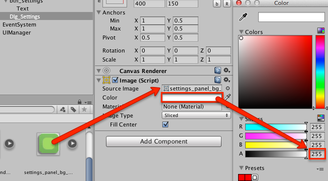
- Select Panel in the Hierarchy and rename it to Dlg_Settings.
- Set its anchors to middle-right, since you’ll position the dialog beyond the right edge and off the screen, so that it’s not visible when you run the scene.
- Set Width to 400 and Height to 150.
- Set Pos X to 220 and Pos Y to 0.
You should see a semi-transparent rectangle to the right of the canvas rectangle. All UI elements outside this rectangle are not visible on the screen. This is precisely what you want for the dialog!
Setting the Dialog’s Background Image
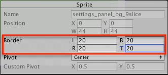
You’re going to use a 9-slice image as the dialog’s background, so you need to set the border in the Import Settings first.
Open the Menu folder in the Project window and select settings_panel_bg_9slice. In the Inspector, click Sprite Editor to open the Sprite Editor view.
Set all Border values to 20 and click Apply at the top.
Now you can use this image as the dialog background.
Select Dlg_Settings in the Hierarchy and drag settings_panel_bg_9slice to the Source Image field in the Inspector. Double-click on Color right next to the Source Image field, and set A to 255 to remove transparency.
This is how the dialog should look like after you set the background image:

Adding the Label
In its present state, it’s difficult to argue that the nondescript, green rectangle is actually a settings dialog, but there’s an easy way to fix this — all you need to do is to write “Settings” on it. Poof! Whoosh! Magic. :]
Select GameObject \ UI \ Text to create a new Text UI element. Select Text in the Hierarchy and rename it to Lbl_Settings. Then drag Lbl_Settings over Dlg_Settings to add it as a child object.

After that, select Lbl_Settings in the Hierarchy and make following changes:
- Set anchors to top-center.
- Set Pos X to 0 and Pos Y to -40.
- Change Text to Settings.
- Open the Fonts folder in the Project window and drag the DCC – Dreamer font to the Font field in the Inspector.
- Set Font Size to 30.
- Set Alignment to Center Align.
- Set Color to White, with A (Alpha) 255 to remove transparency.

Animating the Settings Dialog
Now you’ve got a legitimate Settings dialog, the next step is to make it appear when the user clicks the Settings button.
You’re going to use almost exactly the same technique as you did to make the buttons slide in and out, the only difference being that the dialog won’t slide in automatically after the scene starts.
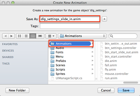
Select Dlg_Settings in the Hierarchy and open the Animation view. Then create a new animation by clicking on the Create button in the Animator.
Name the animation dlg_settings_slide_in and save it in the Animations folder.
Then click on the 1:00 mark in the timeline and make sure recording is started, or start it manually by clicking the record button.
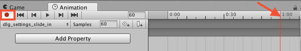
In the Inspector, set anchors to middle-center and Pos X to 0.

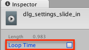
Stop recording the animation, open the Animations folder in the Project window and select dlg_settings_slide_in. In the Inspector. Finally, uncheck Loop Time.
Select Dlg_Settings in the Hierarchy and open the Animator view. Copy and paste the dlg_settings_slide_in state to duplicate it. Rename the duplicate to dlg_settings_slide_out, and set its Speed to -1.

Note: This time, don’t change the default state! The dialog’s default state should stay dlg_settings_slide_in.
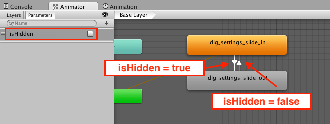
Click the + button and add a new Bool parameter named isHidden.
Create two transitions between the states, just as you did for the buttons. Then add the isHidden parameter of type Bool.
Change the condition of the dlg_settings_slide_out => dlg_settings_slide_in transition to be isHidden equals false. For the dlg_settings_slide_in => dlg_settings_slide_out transition change the condition to isHidden equals true.
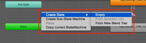
Next, right click in the Animator and select Create State and then choose Empty.
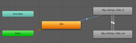
In the Inspector, name the state idle. Next, right click the state and choose Set as Layer Default State. Finally, create a transition between idle to dlg_settings_slide_in. Set the Condition as isHidden is equal to false.
It should look as follows:
Select File / Save Scenes to save your work so far and then Run the scene and you’ll see the dialog sliding in at the start, and then overlapping the buttons.

This is getting there, but still not what you want. You need to disable the Animator component so it won’t play the animation at the start. You want the dialog to appear on demand which you’ll do next.
Displaying Dialog on Button Click
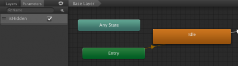
Disable the Animator component so it won’t play the animation at the start by setting the default value for the isHidden to true. Click on some empty space in the Animator window and then set isHidden to true
When you now run the scene, the dialog doesn’t appear straight away — which is good — however, it won’t show up even when you click the settings button. This is not good.
Open the UIManagerScript and add following instance variable:
public Animator dialog;
Then add following code to the end of OpenSettings:
public void OpenSettings()
{
    //..skipped..

    dialog.SetBool("isHidden", false);
}
This enables the Animator component and sets the correct value to the isHidden parameter.
Finally add new method called CloseSettings as follows:
public void CloseSettings()
{
    startButton.SetBool("isHidden", false);
    settingsButton.SetBool("isHidden", false);
    dialog.SetBool("isHidden", true);
}
This returns the buttons and hides the dialog. You’ll add the UI element that calls this method in a moment.
Save the UIManagerScript and switch back to the Unity editor.
Select UIManager in the Hierarchy and drag Dlg_Settings to the Dialog field in the Inspector.

Run the scene, then click the Settings button and see how the buttons slide out as the dialog slides in.
That’s better, but you can’t close the dialog.
To fix this, you need to add some kind of close button to the dialog.
Adding the Close Button
Select GameObject \ UI \ Button to create a button. Rename this new button to Btn_Close and drag it over Dlg_Settings in the Hierarchy to add it as a child object. Also, this button won’t have text on it, so remove the Text object nested in Btn_Close.
This is what you should have in the Hierarchy at this point:
Now select Btn_Close and follow these steps:
- Set anchors to top-right.
- Set both Pos X and Pos Y to 0.
- Open the Menu folder in the Project window and drag settings_btn_close to the Source Image field in the Inspector.
- Click Set Native Size.
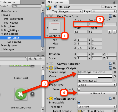
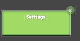
This is how the dialog should look in the Scene view now:
Note: This time, you’re going to use another method to highlight the button’s image (Transition property in the Button script) called ColorTint, which is the default transition type. You’ll do this instead of adding two more images to represent highlighted and pressed button states.
The button looks great, but it does nothing. Fortunately, you’ve already added the method this button needs to call.
Select Btn_Close in the Hierarchy, scroll down to the On Click() list and click +. Drag UIManager from the Hierarchy to the new item and then select the UIManagerScript \ CloseSettings () method in the dropdown.
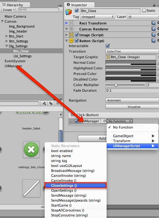
Select File / Save Scenes to save your work so far and then Run the scene. Click the Settings button and close the scene by clicking Close after the dialog slides into the scene.
Hey, you’ve done well. That looks nice! :]
Adding Sound Settings
There’s not much sense in keeping a meaningless settings dialog, so, it’s time to add some actual settings to it. In this dialog, the player will have control over the music’s volume in the menu scene.
Music? Yes, what fun is a game without a rockin’ soundtrack?
Adding Music to the Menu Scene
You’re welcome to rummage around your files for a suitable clip, but you don’t have to because the project already contains a snappy music track. All you need to do is to play it.
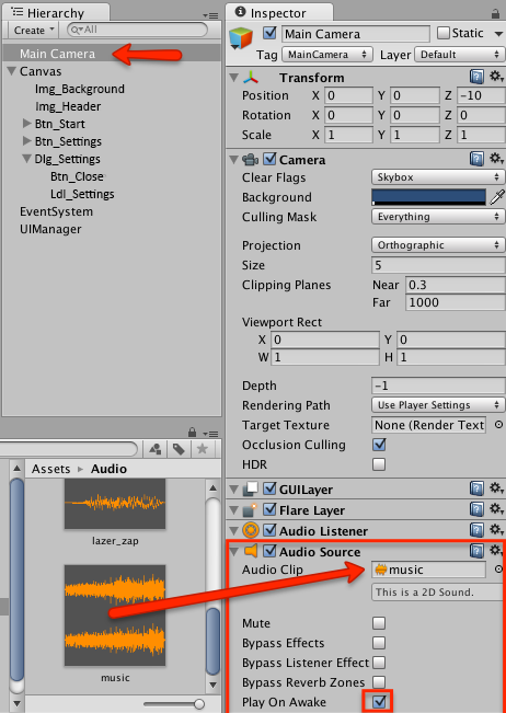
Select Main Camera in the Hierarchy and add the Audio Source component. Then, in the Project window, open the Audio folder and drag music to the Audio Clip field in the Inspector.
Enable Play On Awake.
Toggling Music On and Off
To toggle music on and off you’re going to use a…wait for it…toggle control. Select GameObect\UI\Toggle to add a toggle UI element to the scene.
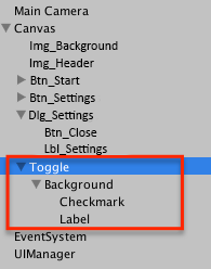
The toggle controls consist of the root object which has a Toggle script attached, and several child objects:
- Background: Image that is always visible (i.e. in both On and Off states)
- Checkmark: Image that is only visible when toggle is active (ON).
- Label: A label displayed next to toggle.
You don’t need a label this time, so remove the nested Label. Then rename toggle to Tgl_Sound and drag it over Dlg_Settings to put it inside the dialog. This is what you should see in the Hierarchy after you’re done:

Select Tgl_Sound in the Hierarchy. Set its anchors to middle-left, Pos X to 115 and Pos Y to -10.
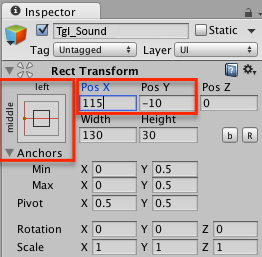
Note: Remember how anchors and position are set relative to the parent? This is why it’s important to add tgl_sound as a child of dlg_settings first and only after that set its position.
Keep in mind, changing anchors and pivot won’t change the UI element position, instead, they update position fields (e.g. Pos X, Pos Y, Left, Right) to values that position the element at the same place by using new anchors and pivot. Set these first, and play with the them to set the correct position.
Also, under the Toggle (Script) component, uncheck the Is On checkbox.
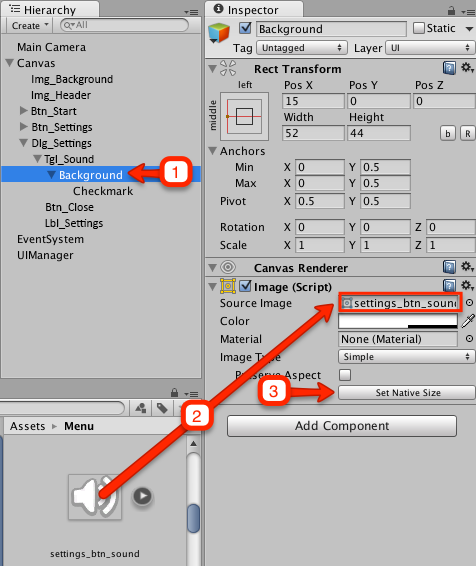
Now you need to specify images for the Background and Checkmark child objects. Just as you’ve done with the other images, you will take them from the Menu folder, so open that folder in the Project window.
You’re going to need two images:
- settings_btn_sound for Background
- settings_btn_sound_checkmark for Checkmark
Select Background contained in tgl_sound in the Hierarchy and drag settings_btn_sound from the Project window to Source Image in the Inspector. Then click Set Native Size.
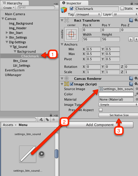
Then select Checkmark and repeat the previous steps, but this time use the settings_btn_sound_checkmark image from the Project window.
This is what you should see in the Scene View:
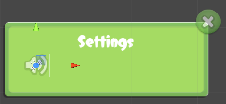
Note: As you can see, the size of the root object (wide rectangle) doesn’t match the background images. You can adjust its size, but it is just fine this way.
Muting the Music
The good thing about UI elements’ event handlers is that sometimes you can get away without writing any code at all. Instead, you can set the UI element to change the property or directly call a function of the component attached to the object using only Unity’s interface.
Here’s how you can change the mute property of the Audio Source component attached to MainCamera.
Select Tgl_Sound in the Hierarchy, and in the Inspector find the On Value Changed (Boolean) list. Click + to add a new item.

Drag MainCamera from the Hierarchy to the newly added item. Open the function selection dropdown and select AudioSource\mute from the Dynamic bool section at the top.
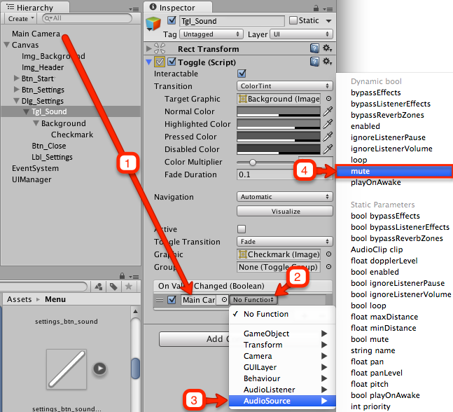
Note: When you look closely at the function selection options, you’ll see two mute properties: one in the Dynamic bool section and the other in Static Parameters.
The difference is quite trivial. If you select mute in the Dynamic bool section, its value will be set to the current value of the toggle’s Active property each time you toggle it.
If you select the mute property from the Static Parameters section, the new input field will appear and you’ll be able to set its value in the Inspector to some constant value.
Of course, in the Dynamic bool section there are only properties and methods that take bool values, because toggle’s active property type is bool. Since you can specify any value as the static parameter, the Static Parameters section contains all public properties and methods.
Hence, when the toggle is active (e.g. active equals true) it sets the mute property of AudioSource to true and mutes the music.
Select File / Save Scenes to save your work so far and then run the scene, open the settings dialog and try switching music ON and OFF.
Using Slider to Regulate the Volume
It’s really cool that toggle can synchronize its ON and OFF states with some other component’s field, but what if you have a range of values? In this case, you can use the Slider UI element.
Select GameObject \ UI \ Slider to add a slider. Rename it to Sdr_Volume and put it inside Dlg_Settings.
Select Sdr_Volume in the Hierarchy and set its anchors to middle-right. Then set its anchors to (1, 0.5) so that you could position it using the middle point of its right edge.
Finally set its Pos X to -20, Pos Y to -10, Width to 270 and Height to 35.

This is how the Settings dialog should look right now:

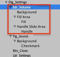
If you take a look at the Hierarchy, you’ll see the slider control has more parts than a toggle or button. Here are the main parts:
- Background: Image that shows the bounds of the slider and its inner area when it’s not filled (i.e. when handle is all the way to the left).
- Handle: Image for the handle. You drag it to change the slider’s value.
- Fill: Image that stretches to show the value of the slider.
In fact, the fill image is not the only part that can stretch, so normally it’s better to use 9-scale images for all three parts. And you have such images! Lucky you! :]
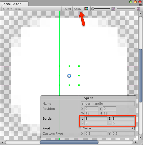
Open the Menu folder in the Project window and find three images corresponding to each part of the slider: slider_background, slider_fill and slider_handle.
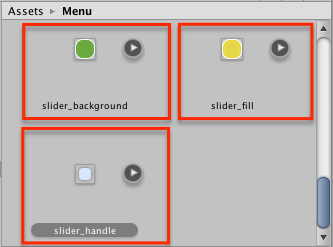
For each image, open the Sprite Editor in the Inspector and set all values for Border to 8. Click Apply.
Now you need to set the corresponding image for each part of the slider:
- Select Background and drag slider_background to Source Image in the Inspector.
- Select Fill (not Fill Area) and drag slider_fill to Source Image.
- Select Handle and drag slider_handle to Source image.
If you run the scene now and open the Settings dialog, you should see something like this:

Changing the Volume of the AudioSource Component
Changing the music volume using the slider is similar to what you did with the toggle.
Select Sdr_Volume in the Hierarchy. In the Inspector, scroll down to see the On Value Changed (Single) list and click + to add a new item.
Drag MainCamera from the Hierarchy to that new item in the list, open the function selection dropdown and select AudioSource\volume in the Dynamic float section.

Select File / Save Scenes to save your work so far and then run the scene, open the Settings dialog and change the slider’s value. You should hear the volume go up and down as you drag the slider handle. Personally, I find it to be a super-awesome feature. :]
Where To Go From Here?
Just as I promised in the end of Part 1, in this part you’ve added more controls, learned how to animate them and made a fully functioning menu scene. While it’s fairly simple, you’ve explored most of the UI controls.
If you’d like to see it in its final, perfect form, download it here: Rocket Mouse Part Two Final Project
In Part 3, the final part, you’re going to learn advanced techniques, including using the mask component to create a sliding menu. Also, you’ll create more animations and learn how to migrate legacy GUI code to the Unity UI.
If you have any questions, comments or discoveries to share, please feel free to join the conversation below.


Comments