Introduction to Unity UI – Part 1
In this first part of a three-part tutorial series, you’ll get acquainted with the Unity UI and learn how to add custom user interfaces to your game.

Update 20th December 2016: This tutorial was updated to Unity 5.5 by Brian Moakley. Original post by Kirill Muzykov.
You’ll love getting gooey with Unity’s new GUI!
Do you remember the old UI system in Unity? It required you to write all your GUI code in OnGUI. It was slow, inefficient and programmer-centric, going against the visual nature of Unity. Thankfully, Unity Technologies has made some changes.
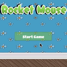
In this three-part series, you’ll explore Unity’s new UI system by adding an interactive UI to a game called Rocket Mouse.
To satisfy users’ cravings for an engaging UI, you’ll also learn to:
- Animate buttons
- Create a settings dialog that slides into a scene
- Use more GUI controls like Text, Slider, Panel and Mask
Getting Started
You’ll need some images for backgrounds, buttons and other UI elements, as well as a few fonts for the labels and buttons. Don’t worry, you won’t have to draw anything yourself or scour the web for the right assets. I’ve prepared a special package that has everything you need. You’re welcome. :]
Download the package here: RocketMouse_GUI_Assets.
The package contains background images, buttons, icons and other game art, in addition to two fonts from DaFont. The game art is provided by Game Art Guppy, where you can find a lot of other game art for your practice games. You can thank Rodrigo Fuenzalida for the Titan One font and Draghia Cornel for the DCC Dreamer font.
Lastly, you’ll need to download the starter project containing the RocketMouse game. Download and unpack the Rocket Mouse project using the following link: Rocket Mouse starter project
[TODO: FPE: Can all of these resources be combined into one package with a Download Materials button? If so, please create a Download Materials Button and insert here. Please also add a Download Materials button at the bottom of the tutorial. Finally, if it’s possible to combine all of those links into one package, please replace the previous three paragraphs with a single line inviting the learner to get everything she needs by clicking the Download Materials button.]
This is all you need!
Creating MenuScene
Open the RocketMouse_Starter project in Unity by selecting Open within Unity’s startup dialog and specifying the root folder of the project.
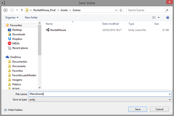
Now, you’ll create a new scene to work with. From the menu bar, Select File ‣ New Scene to create a new empty scene.
It’s best to save the scene right away. Open the Save Scenes dialog by choosing File ‣ Save Scenes. Then, enter MenuScene as the scene name and save it to the Scenes folder, right next to the RocketMouse scene.
Take a look at the Project window to confirm there are two scenes in one folder:

Importing Images and Fonts
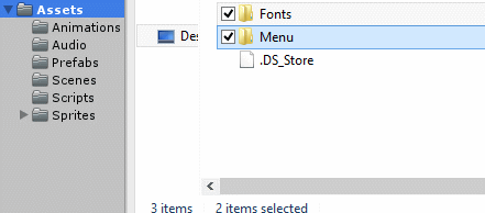
First on your to-do list is adding assets to the scene, so unpack the assets package. There you’ll find two folders: Menu and Fonts.
Select both folders, and then drag them to the Assets folder in Unity’s Project window:
Woo-hoo! You’ve finished the setup and are ready to create your first UI element using the new Unity GUI system.
Adding Your First UI Element
The first element you’ll make is the background image for the menu scene.
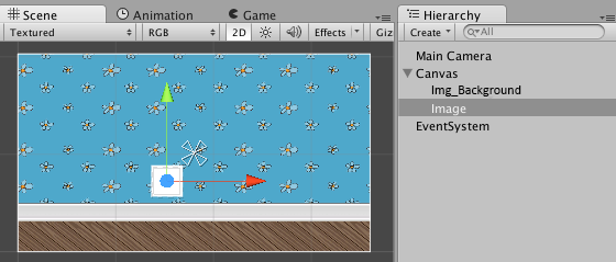
From the top bar, select GameObject ‣ UI ‣ Image. This adds an object named Image to the scene. You should see it in the Hierarchy as a child of Canvas. All elements must be placed on a Canvas. If you don’t have one, Unity will create one for you automatically.
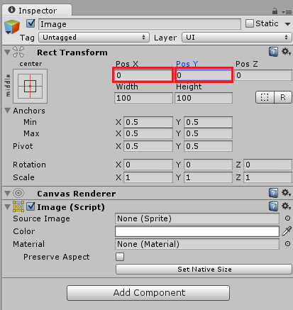
To ensure you can see the image in the scene view, select Image in the Hierarchy and set both its Pos X and Pos Y to 0.
You’ll set the correct position and size in a moment. Right now, there are three things to be aware of. In the Hierarchy, you’ll see three new objects in the scene:
- Image
- Canvas
- EventSystem
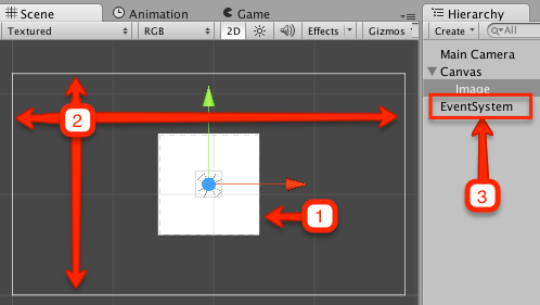
The Image is a non-interactive control that displays a sprite, with many options for customization.
For instance, you can apply color to the image, assign a material to it, control how much of the image displays or even animate it on the screen using a clockwise wipe.
The Canvas is the root object for all your UI elements. Remember, Unity creates this for you when you add your first UI element. It has multiple properties that allow you to control how your UI renders.
The EventSystem processes and routes input events to objects within a scene. It’s also responsible for managing raycasting. As with the Canvas, The UI requires the Event System, so Unity automatically adds it.
Setting Up the Menu Background Image
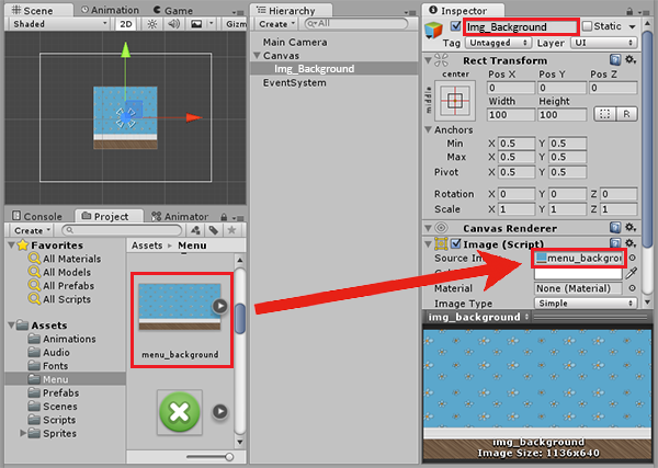
First, rename your image. In the Hierarchy, select Image and rename it to Img_Background.
Next, open the Menu folder in the Project window and find the menu_background image. Drag it to the Source Image field of the Image component in Img_Background in the Inspector:
Now you have a background image instead of the default white image. However, it’s not great! It’s too small and the aspect ratio is incorrect.
To fix this, find the Set Native Size button in the Inspector and click it to set the size to 1136 x 640.

Now it looks like a proper background.
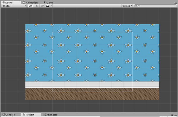
Uh-oh. There’s still one problem.
Shrink your Scene view, and you’ll see that the white rectangle of the Canvas covers only part of the image. If you switch to the Game view, you’ll see only a part of the background image, as if the camera is too close to the image to capture it completely.

You’ll tackle this issue by using a Canvas Scaler.
Using the Canvas Scaler
You’ll use the Canvas Scaler to adjust the background image display.
First, you need to know that the display is not the result of a bug. From Unity’s point of view, you have the Game view — or viewport — set to such a small size that it displays only the portion of the image that fits within the Game view.
If you were to run the game on a device with a large enough resolution or stretch the Game view to fit the whole image, you would see the entire background image.
Although Unity’s settings make sense in most scenarios, there are times when you need different behavior. An example is when you have a small monitor that doesn’t fit your target device’s resolution.
Additionally, many games support only one resolution. Designers use this reference resolution to dictate sizes, positions and other data. When you develop a game based on a single reference resolution, make sure to enter the designer’s specifications without additional calculations so that the user sees everything as intended.
If you’ve ever ignored your designer’s directions, you know there’s a price to pay. The user experience and varying resolutions are important, but try to keep your designer happy, too. :]
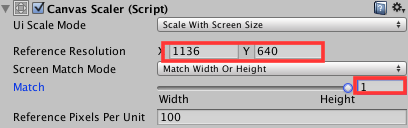
Canvas Scaler to the rescue! By default, every Canvas includes Canvas Scaler.
Select Canvas in the Hierarchy, and in the Inspector, you should see the Canvas Scaler component:

The Canvas Scaler has three scale modes:
- Constant Pixel Size: Makes UI elements retain the same pixel size, regardless of the screen size. This is the default value of the Canvas.
- Scale With Screen Size: Sizes and positions UI elements according to a referenced resolution. If the current resolution is larger than the referenced resolution, the Canvas will maintain the reference resolution, while scaling up the elements to match the target resolution.
- Constant Physical Size: Positions of the UI elements are specified in physical units such as millimeters or points. This requires the correct reporting of the screen DPI.
Change the component mode to Scale With Screen Size and set its Reference Resolution to 1136 x 640. Also, slide Match Width or Height all the way to the right or enter 1 in the input field.
After making those changes, you’ll see the full background image, even in a small Game view window.

Change the Game view resolution to see how your game might look in a different resolution, for example, on iPhone Wide 480×320. You’ll notice it still looks good!
Unity will reprocess all your assets, and it may take a while. At the end, you should have access to the various iOS screen sizes.
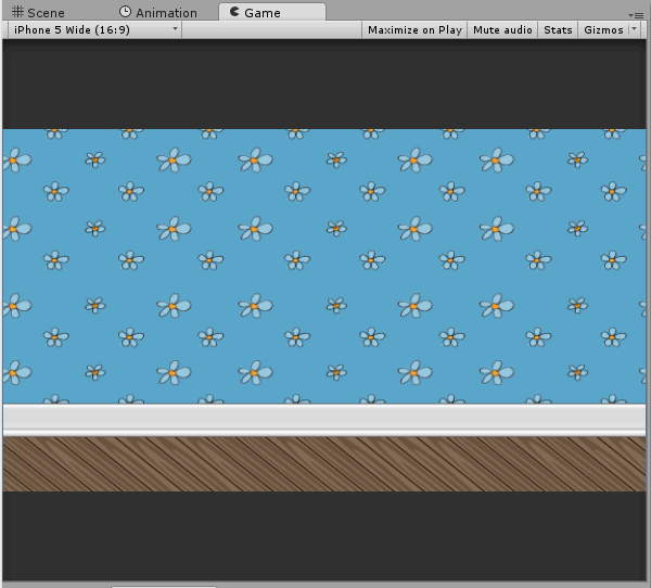
Now switch to the Scene view, and you’ll see the Canvas’s size doesn’t change when you resize the Scene view.
The side edges of the screen are neatly cropped while the central part is fully visible. This is the result of setting Match Width or Height to 1. It works perfectly for your target resolutions.
What about the buttons? What happens when they’re too close to the left or right edge of the screen? You don’t want to crop or hide them.
Fortunately, Unity has a feature that will help you sidestep this rookie mistake. You’ll learn about it soon.
Adding a Header Image
Did it seem to take a lot of time to add the background image? That’s because you were setting up the initial UI. After doing this a few times, you’ll find the setup to be so fast and easy that you’ll barely have time to blink before you’re done.
Before moving on to buttons and other UI controls, you’ll add the header image. For this exercise, you’ll use a non-fullscreen image to demonstrate a few other important concepts of Unity’s new UI system.
Open the Scene view, and from the top bar, select GameObject ‣ UI ‣ Image. This will add another image as a child of Canvas:
Now, turn that white rectangle into an actual image by following these steps:
- Select Image in the Hierarchy and rename it to Img_Header.
- Open the Menu folder in the Project window and search for the header_label image.
- Drag the image to the Source Image field on the Inspector.
- Click Set Native Size in the Inspector.
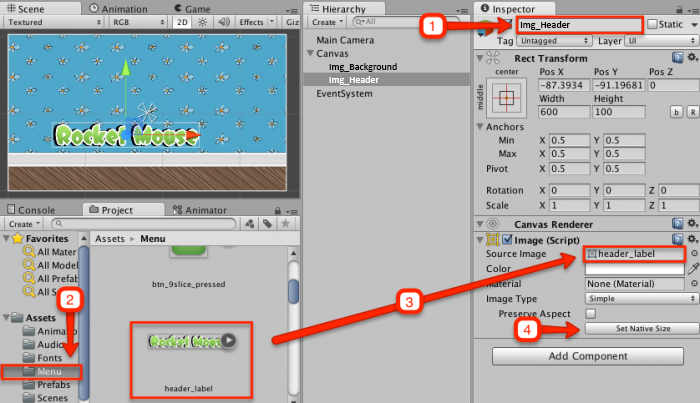
As you can see, it was easy enough to add another image. Now, you’ll work with the Rect Transform component to position it.
Rect Transform, Anchors, Pivot and You
If you’ve worked with Unity before or completed other Unity tutorials on this website, you may have had some exposure to the Transform component. If not, that’s fine. Transform is a tool that can position, rotate and scale objects in a scene. Here’s what it looks like:
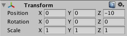
You’ll see the Transform component when you select any type of non-UI GameObject in your Hierarchy view. However, if you select any UI element, for example, Img_Header, you’ll see a different component named Rect Transform.
As you can see, Transform and Rect Transform look different. Additionally, the Rect Transform can change the way it looks, depending on its anchor settings. For example, it can look like this:
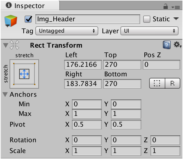
Here, instead of Pos X, Pos Y, Width and Height, you have Left, Top, Right and Bottom.
Are you wondering about the anchor setting that changes the look of Rect Transform so dramatically? Keep reading!
Anchors
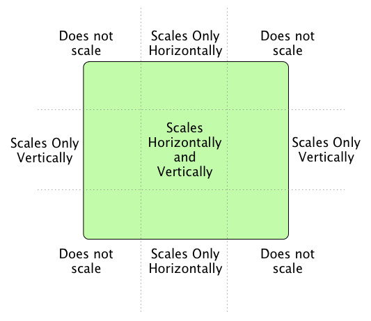
Setting anchors is a simple, elegant and powerful way to control the position and size of your UI elements relative to their parent. It’s especially handy when you have to resize the parents.
When you set anchors, you specify several positions in the parent, usually one in each corner of the parent’s UI element Rect. When this happens, your UI element will try to maintain a uniform distance to the anchor points, forcing it to move or resize along with its parent.
To see different Anchors Presets, select Img_Header in the Hierarchy and click on the rectangle above the Anchors field in the Rect Transform component.
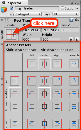
After clicking, you’ll see various Anchors Presets. These are the most common settings for anchors, but you can customize them. You can also select different horizontal and vertical behavior for your UI element.
This will all make more sense once you work with it. If you look at the next image, which has the background image disabled, you’ll be able to see the Canvas size changes a bit better.
As you can see, the anchors settings control how your UI element adapts to screen size changes.
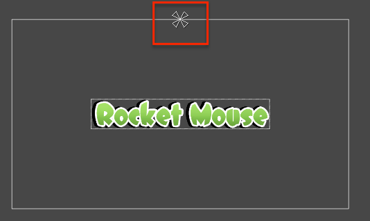
The four triangular handles representing anchors resemble a flower. Here’s how it looks with anchors set to the top-center preset:
Before you start experimenting with different settings, read through the next section. It’ll help you understand anchors a little better, and you’ll get more out of your experimentation.
Custom Anchors
You can manually move anchors to a custom position. The presets are just for your convenience.
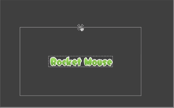
In this case, select the anchor icon by choosing an anchor preset, for example, the left-hand side of the screen. The anchor icon will shift to that part of the screen, allowing you to select and move it at will.

See how the image moves to the right when you resize the Canvas? It moves only a little in relation to the right edge of the Canvas because these anchors are set to 25% width of the Canvas.
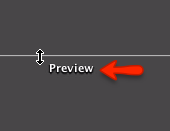
Splitting Anchors
You can split anchors to make them stretch a UI element horizontally, vertically or both.
Look for the word Preview next to the cursor when you try to resize it. Use this technique to experiment and see how your UI elements adapt to different screen sizes.
Rect Transform Depends on the Current Anchors Setting
Depending on the anchors setting, the Rect Transform provides different ways to control the size and position of your UI element.
If you set anchors to a single point without stretching, you’ll see the Pos X, Pos Y, Width and Height properties.
However, if you set anchors in a way that stretches your UI element, you’ll get Left and Right instead of Pos X and Width if you set it to stretch horizontally. You’ll get Top and Bottom instead of Pos Y and Height if you set it to stretch vertically.
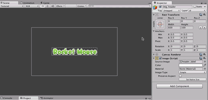
In this screenshot, Img_Header’s Anchors are set to middle-stretch. This means the image stays in the middle of the Canvas vertically and stretches horizontally.

Pivot
The final property to discuss in the Rect Transform component is Pivot.
The pivot is the point around which all transformations are made. In other words, if you change your UI element position, you also change the pivot point position. If you rotate your UI element, it’ll rotate around that point.
The pivot uses normalized coordinates. This means that it goes from 0 to 1 for both height and width, where (0, 0) is the bottom left corner and (1, 1) is the top right corner.
You can change the pivot in the Rect Transform component in the Inspector, or you can use the Rect Tool.

The following two images demonstrate a UI element with the same Pos X and Pos Y values, yet each shows different placement in the scene.
The first image shows the pivot at its default value of (0.5, 0.5), which is the center of the UI element. The position is set to (0, 0) and the anchors are set to top-left.

Now, take a look at the second image. As you can see, the position is still at (0, 0), but since the pivot is set to the bottom-left corner (0, 0) you can see that the image’s bottom corner, and not the center, is now at the Canvas’s top-left.
It’s harder to show how pivot affects rotation and size using a still image, so here are few animations:
Notice how the image rotates around the pivot point, indicated by a blue circle, which is an element you can freely move.

As you can see, the pivot also affects how your UI element resizes.
Be aware that there are a few differences between size and scale. For example, size can’t be negative, but scale can be. Also, using a negative scale value will flip your UI element. In most cases, you should only change the size of your UI elements.
Placing a Header Image
Phew! That was a lot of information about Rect Transform, Anchors and Pivot. Believe me, you’ll be grateful you spent the time working through the exercise, as these concepts are essential to creating awesome UI in your games.
Going forward, you’ll concentrate on creating the menu scene. The rest of this tutorial will go by in the blink of an eye!
All those manipulations exhausted the poor little img_header. It’s time to place it where it should be and leave it alone to recover.

Before you continue, if you disabled Img_Background, re-enable it to see the Canvas border.
Select Img_Header in the Hierarchy and set its properties in the Inspector as follows:
- Click Set Native Size to reset the size, as you probably messed with it while playing around with the pivot.
- Set Anchors to top-center.
- Set Pos X to 0 and Pos Y to -100.
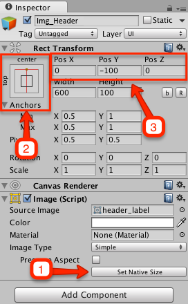
You should see something like this in your Scene view:

That’s it! Now, leave the header image alone. It’s a little tired, too. :]

Adding the Start Button
Now, that your game has a nice background with a label, it’s time to add some buttons.
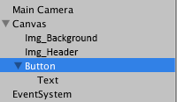
From the top bar, choose GameObject ‣ UI ‣ Button. This will add a Button object to the scene. You should see it in the Hierarchy. If you expand it in the Hierarchy, you’ll see that the button contains a Text child — you’ll learn about these later.
Look at the button in the Inspector, and you’ll see it has the same Image component you used to add the background and the header label.
Additionally, there’s a Button component. In other words, a button is just an image with a child Text element and an attached button script.
Positioning the Button
Now it’s all about positioning and resizing the button. Follow these steps:
- Select Button in the Hierarchy view and rename it to Btn_Start.
- Set its Anchors to bottom-stretch, since you want it to stretch horizontally if the screen size changes.
- Set both Left and Right to 350.
- Set Height to 80.
- Set Pos Y to 300.

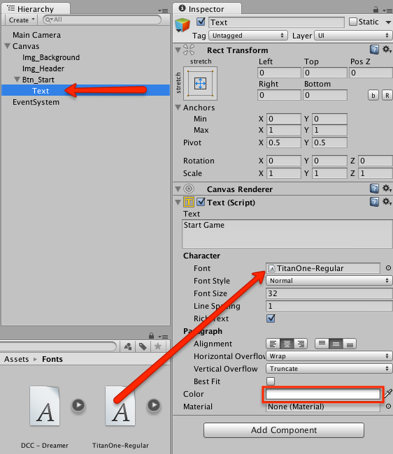
Then select the nested Text element and set its Text to Start Game. Change the Font Size to 32 to make the text of the button larger.

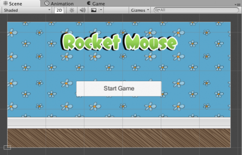
This is what you should see in the Scene view:
Now you have a button, but it needs a facelift! To make the button look good, you’ll set an image as its background and then use a fancier font.
9-Slice Scaling
You set the image for buttons and images in the same way. After all, they use the same component. However, images rarely scale, especially non-uniformly. Buttons, on the other hand, often come in different sizes.
You could create a background image for every single button size in your game, but why waste all that space? You’ll use a technique called 9-Slice scaling, which allows you to provide one small image that scales to fit all sizes.
There’s no magic involved here. This technique works by creating different images for each of nine zones, all of which scale differently.
This ensures the image will look good at any scale.
Preparing Button Images
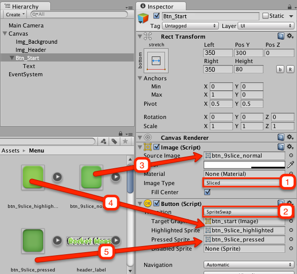
Before you can use a sliced image, you need to set its nine zones. To do this, open the Menu folder in the Project window and select btn_9slice_normal image.
In the Inspector’s Import Settings, set Texture Type to Sprite (2D and UI) and apply the change. Next, click on the Sprite Editor button to open the Sprite Editor view.

In the Sprite Editor, set the Border values to L:14, R:14, B:16, T:16. Remember to click Apply!

Repeat the same process for btn_9slice_highlighted and btn_9slice_pressed images, which you’ll use for different button states.
Setting Button Images
After preparing all your images, drag them to the corresponding fields in the Inspector. Select Btn_Start in the Hierarchy and follow these steps:
- Change Image Type to Sliced in the Image component.
- Change the Transition property in the Button component to SpriteSwap.
- Drag btn_9slice_normal to Source Image in the Image component.
- Drag btn_9slice_highlighted to Highlighted Sprite in the Button component.
- Drag btn_9slice_pressed to Pressed Sprite in the Button component.
Before running the scene and enjoying your cool buttons, you’re going to change the font used by the nested Text label. This will make the button mega-awesome.
Setting a Custom Font for the Button
Using a custom font is easy. Remember the Fonts folder in the package you downloaded and added to the project? Now it’s time to break it out and use one of those fonts.
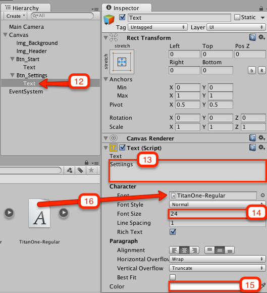
Select the Text element nested within Btn_Start in the Hierarchy. Then open the Fonts folder in the Project window and drag the TitanOne-Regular font into the Font field. Also set the Color to white.
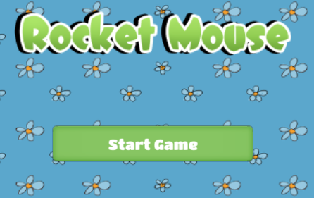
Now run the scene and enjoy your new mega-awesome button! :]
Adding the Settings Button
There are a few things left to do. First, add the Settings button.
You can probably do this yourself, so you’re only getting the size and position of the button to start. The rest is almost identical to they way you created the Start Game button.
These properties of the Settings button are different:
- Name: Btn_Settings
- Rect Transform: Left and Right are 400, Height is 70 and Pos Y is 180
- Text: Settings
- Fontsize: 24
[spoiler title=”Solution Inside: Need help creating the Settings button?”]
If you couldn’t quite do it, just follow these steps:
- From the top bar, select GameObject \ UI \ Button. This will create a Button object in the scene.
- Select Button in the Hierarchy view and rename it to Btn_Settings.
- Set the button Anchors to bottom-stretch.
- Set both Left and Right in Rect Transform to 400.
- Set Height to 70 and Pos Y to 180.
- Set Transition in the Button component to SpriteSwap.
- Make sure to set Image Type in the Image component to Sliced.
- Open the Menu folder in the Project Browser and drag btn_9slice_normal to Source Image.
- Then drag btn_9slice_highlighted to Highlighted Sprite.
- Dragbtn_9slice_pressed to Pressed Sprite.
- Double-click on Color inside the Image component and check if A is set to 255 to remove any transparency.

- Select nested Text label.
- Change Text to Settings.
- Set Font Size to 24.
- Change Color to White.
- Open the Fonts folder in the Project Browser and drag TitanOne-Regular font into the Font field in the Inspector view.
[/spoiler]
This is what you should see in the Scene view after adding the Settings button:

Now click Save Scenes to save your work.
Starting the Game
The final task for this part is to click the Start Game button and run the second scene in the game itself.
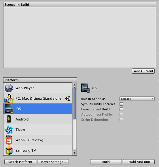
Adding Scenes to Build
Before you can run different scenes, you need to add them to the Scenes in Build list in the Project Settings.
To do this, on the menu select File ‣ Build Settings. This will open the Build Settings dialog. Then open the Scenes folder in the Project browser. First, drag the MenuScene and then the RocketMouse scene to the Scenes in Build list.

Finally, close the Build Settings dialog.
Creating UIManager
When you add an event handler to the button, you need to specify which method to call when you click the button. Since you can’t use static methods, you’ll need to select a public method from a script attached to a GameObject.
From the top bar, choose GameObject ‣ Create Empty. Then select GameObject in the Hierarchy view and rename it to UIManager.
After that, click Add Component in the Inspector and select New Script. Name it UIManagerScript. Make sure the language is set to CSharp and click Create and Add.
This is what you should see in the Hierarchy view and the Inspector view:

Double-click on the UIManagerScript in the Inspector to open the script in MonoDevelop. Once the script loads, remove both Start() and Update().
Next, add the following statement underneath the previous “using” statements.
using UnityEngine.SceneManagement;
This allows you to load other scenes. Now, add the following:
public void StartGame()
{
    SceneManager.LoadScene("RocketMouse");
}
Save the script and move on to the next step:
Calling the StartGame method when the Player Clicks the Button
[TODO: FPE: Is there a simpler header we could use here?]
Switch back to Unity and follow these steps:
- Select Btn_Start in the Hierarchy and scroll down in the Inspector to the On Click() list.
- Click the + button to add a new item.
- Drag UIManager from the Hierarchy to the newly added item in the list.
- Click on the dropdown to select the function. Right now, it’s set to No Function.
- In the opened menu, select UIManagerScript and the select StartGame () in the menu that opens next.

Use Save Scenes to save your work and then Run the scene and click the Start Game button. This should open the game scene.
Where to go From Here?
Did you get stuck anywhere? Feel free to download the completed project for part one.
It might feel like you didn’t do much in this last section, but take another look: You set up the UI, added images and buttons, and even wrote the code that starts the game when you click on the button!
In many games, that’s all that comprises the UI.
You also learned a lot about Rect Transform, Anchors and Pivot. Now that you understand them, you’ll be able to move much faster when you apply these skills to your own projects.
In part two of this series, you’ll learn how to animate UI elements, create dialogs, and use controls like Slider and Toggle. By the end of the series, you’ll have a working menu scene.
If you have any questions or comments please leave them below! See you in Part 2.


Comments